Because business signage is the first visible advertisement for any company’s services or products, corporations spend huge amounts of money researching the most appealing choice of colours for their specific needs. It is true that people are affected psychologically by the colours presented to them in advertising promotions. Choosing the right two basic colours for your business is the foundation upon which you can then add designs and suitable graphics. This is not the time to focus on personal favourites. If you allow modern colour research to guide your choices, you can know that your signage will be doing its job as effectively as possible.
One of the first considerations in choosing the right colour combination is the level of visibility that will be created. By contrasting a light colour font or graphic on a dark background or a dark font or graphic on a light background, viewers will be more drawn to your signage. Fonts should be legible and uncomplicated. The background or graphic should never overpower or distract from the actual message of the sign.
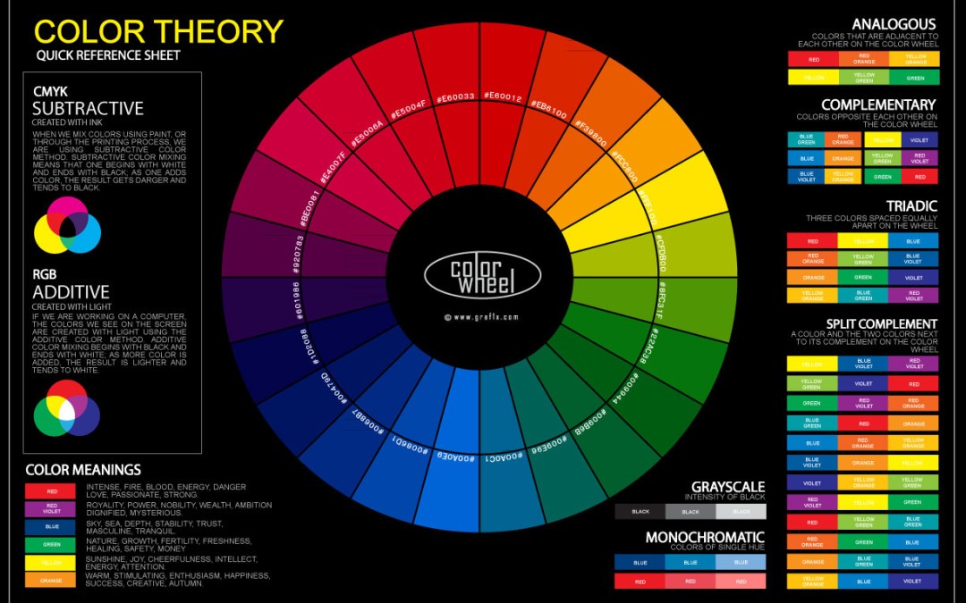
Since people react psychologically to various colours, you should choose the shades that most closely identify with your business or company theme. Warm colours tend to encourage people to feel comfortable enough to relax and linger. If you want customers or clients spending extra time in your store or restaurant, you’ll want to pick from a pallet of colours that have comforting layers of reds, oranges and yellows in them. If you want your signage to be a real attention getter, yellow is a universal favourite. You can pick a signature colour such as hot pink or electric green. Strong reds and blues are always popular choices.
The following examples show how companies have chosen colours to express the message of their unique products or services:
- Yellow (happy feelings) – McDonalds wants every meal to be a “happy meal.” By adding some fiery red, they have created a sign that functions as an appetite stimulant.
- Blue (business confidence) – IBM wants everyone to trust their products.
- Green (health) – Starbucks has a healthier, “greener” product.
- Purple (royal, mystery, wisdom) – Hallmark has the perfectly worded card for every occasion.
- Orange (joy, optimism) – “The world runs on Dunkin.”
- Pink (femininity, love) – Victoria’s Secret is all about romantic, sexy women’s fashions. For professionalism and elegance, black on white is always a good selection. In fact, a white background is a good choice for any strong contrasting colour. Black serves the same purpose when it supports very light or bright letting or graphics. Other complementary choices such as the blue-orange combination that Tropicana has used or a purple-yellow pairing can be very effective.
TIPS FOR CHOOSING THE BEST COLOURS FOR YOUR SIGNAGE
- Does your business already have an established brand colour? You’ll want to work with that unless you are ready to completely overhaul your advertising format.
- Do you want to psychologically impact potential customers by gaining their attention, stimulating their senses or inspiring a certain positive response? What is most apt to motivate them? Orange, yellow and red are generally considered high arousal colours; and blues, greens and violet tend to be lower in arousal response. However, within these families, entirely different reactions can be created by intensifying or lessening the shades.
- Never let an intense background colour or graphic overpower the most important message on your signage.
- Work with contrasting complementary pairs for powerful impact.
- A black-white combination is clearly legible.
(colour combos)
If you need any assistance with colour selection please come in and have a chat with our team here at Laguna Signs. Our designers have expert knowledge on what is effective, colour matching and the print process.